Story
Wikimania is the annual conference of the Wikimedia movement, organized by volunteers and hosted by the Wikimedia Foundation. Since 2005, it has taken place in a different city every year. In 2024, Katowice Poland will be the host city.
Challenge
To create an visual identity for Wikimania Katowice that is unique and distinctive yet aligned with the event overarching visual system and has a connection with the existing Wikimedia Foundation brand.
Outcome
Leveraging the Foundation's existing illustration style and typography and blending traditional Polish motifs with a modern twist, I created a visual identity for Wikimania Katowice inspired by Polish folk culture, food and its graphic design history. As a legacy digital brand, Wikimedia's five-year strategy is to appeal to younger audiences, inline with the strategic direction, the visual identity is playful, vibrant and youthful.
Client
Category
Wikimedia Foundation
Event Branding & Illustration
My Role
Creative Director, Designer, Illustrator

My Contribution
I was the Creative Director, art director and illustrator, conceptualizing the visual strategy, developing the visual identity, creating the illustrations and executing the design.


Visual Identity
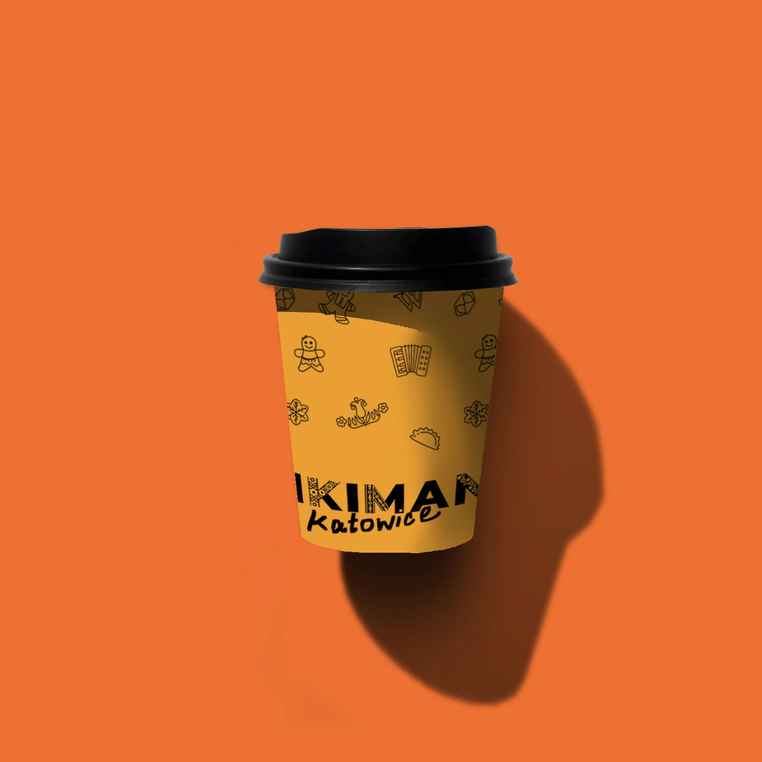
To create a connection with the host city, the visual identity is inspired by Polish folk culture, food and embroidery. To maintain a consistency with the Wikimedia brand, the illustrations echo the Foundation's style and brand uses the same typeface — Montserrat.


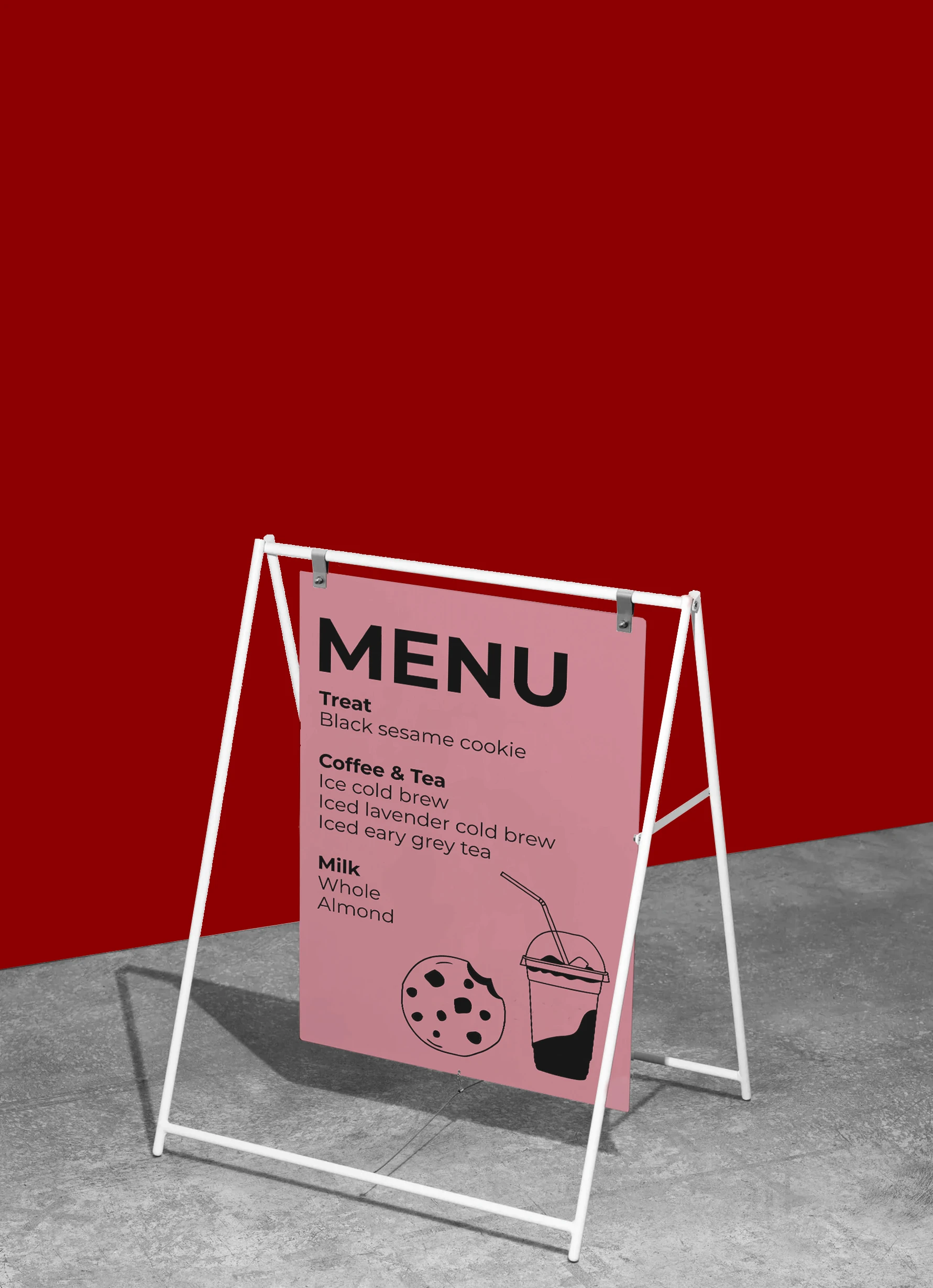
Onsite Event Branding
The brand's presence is extended throughout the conference. As attendees are already onsite, the branding takes a more subtle approach, hinted at through color, illustration and typography.


Social Media & Presentation Templates
Maintaining brand consistency across multiple touch-points, I created social media and slide templates that allow attendees to easily share their conference experiences, promote their event and simplify their presentation creation process.
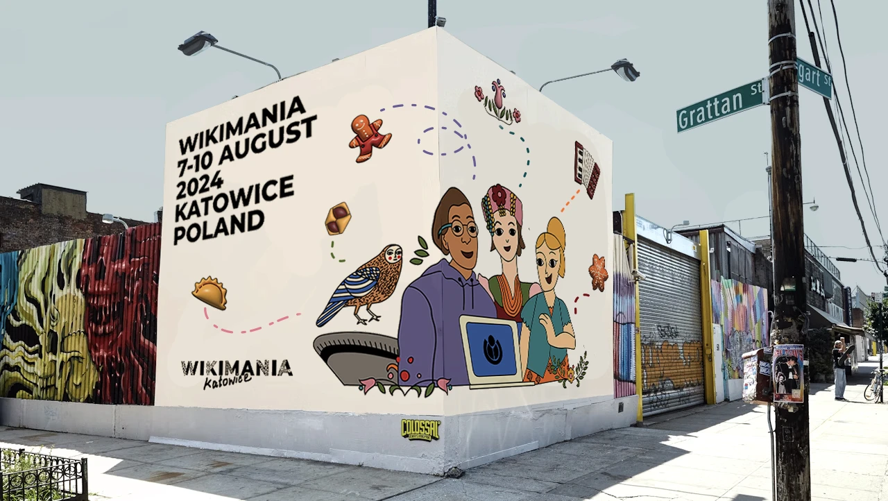
OOH
OOH offer customization, increased visibility and engagement with the community. The visual identity seamlessly scale up to large formats, in varying scales and intensities, with illustrations or photography.


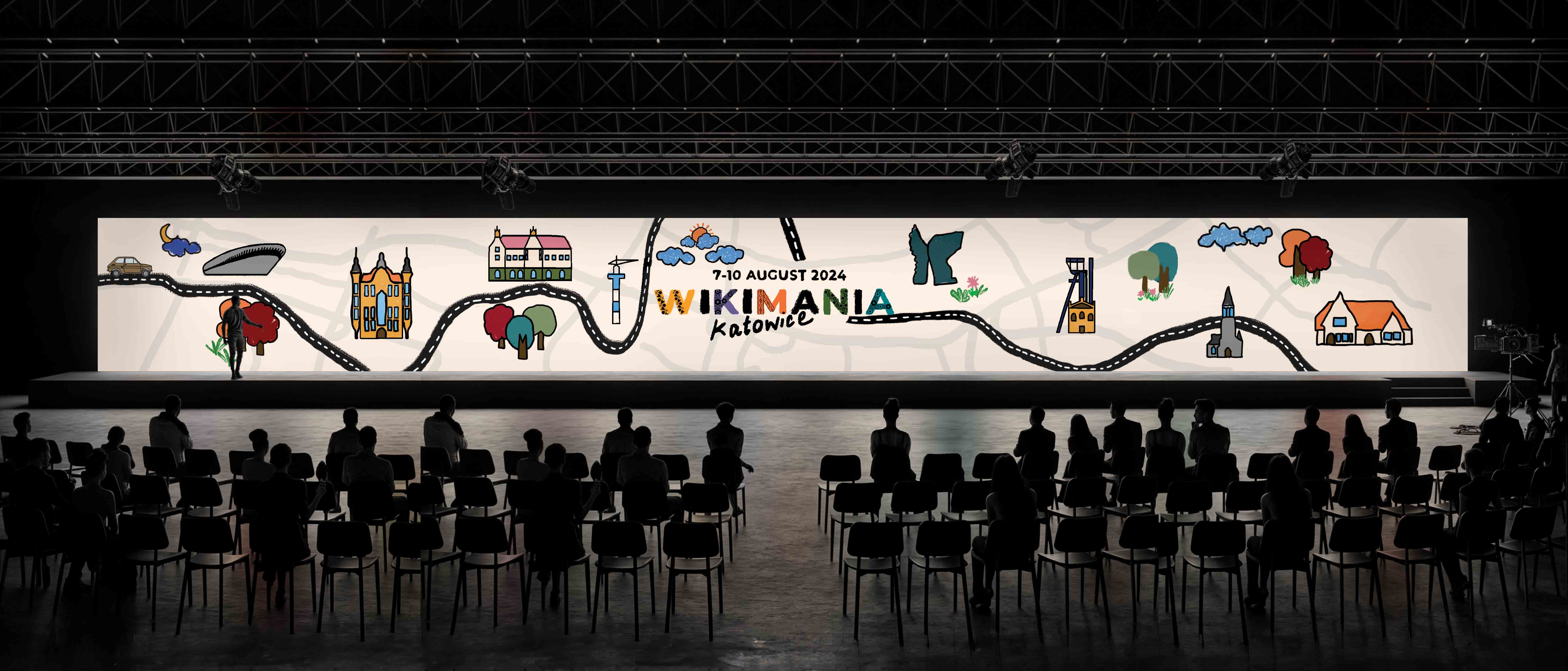
Event screen
Designing for conference screens with large aspect ratios can be challenging. I designed a conference screen background to showcase how the brand can be expressed in this format. Continuing the references to Polish culture, the design features architectural landmarks from Katowice, a map of the city and a Polski Fiat — a classic Polish car.
More projects